
We’ve redesigned the Minismus website — not just to look better, but to work better. As our product range has grown, so has the need for a space that reflects who we are: a brand focused on smart, minimal solutions for busy homes.
The new site offers a cleaner aesthetic, simplified navigation, and a smoother shopping experience — across desktop and mobile.
Here’s what’s changed:
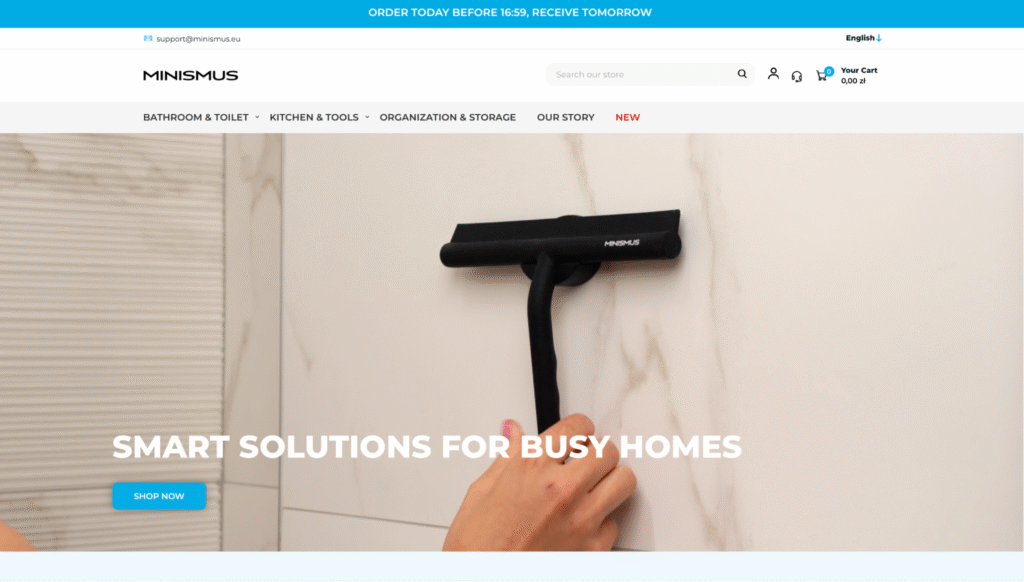
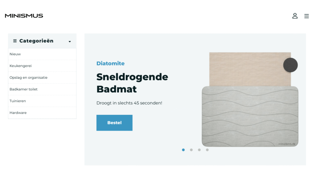
Homepage: From Busy to Balanced
Before: A dense homepage with little structure or visual breathing room.
After: A clear, modern landing page with simple navigation and a strong visual identity.
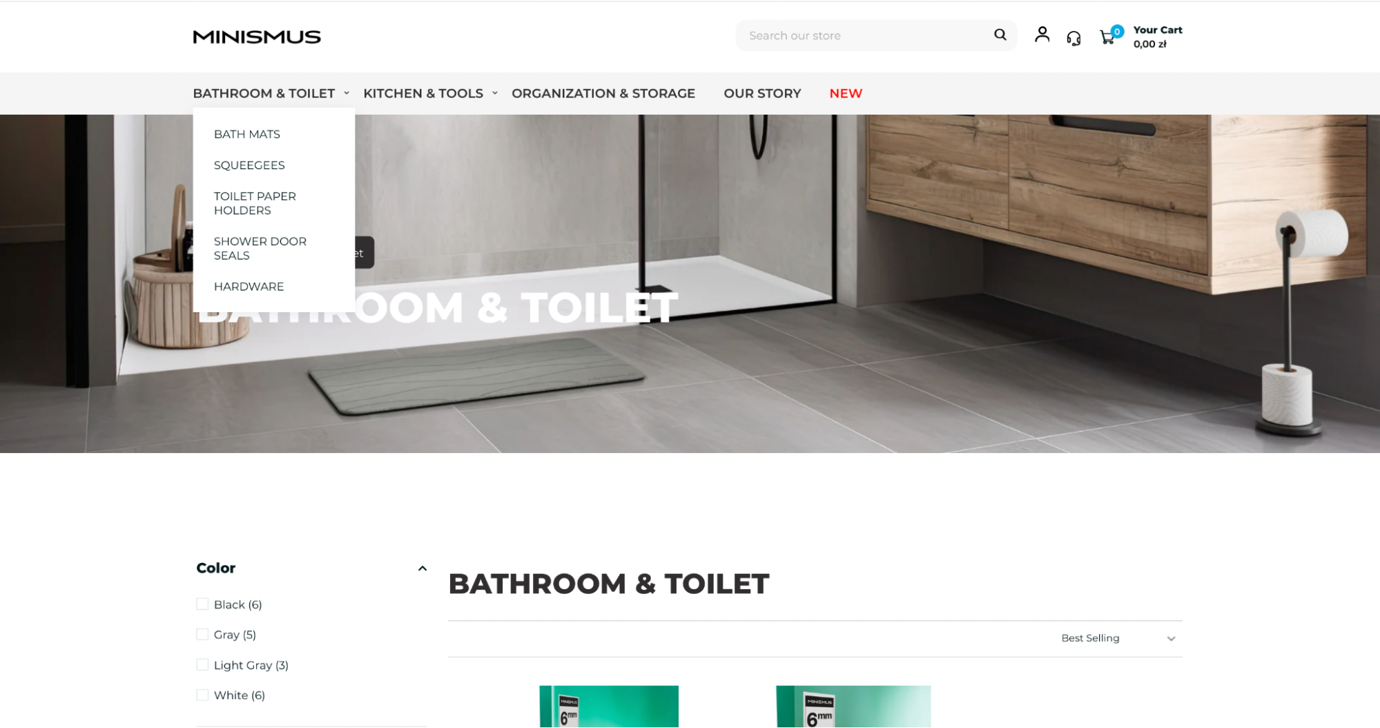
Navigation: Simpler, Smarter Structure
Before: Categories weren’t clearly grouped and hard to browse.
After: A new structure grouped by function — Bathroom & Toilet, Kitchen & Tools, Organization & Storage — with easy access and less guesswork.
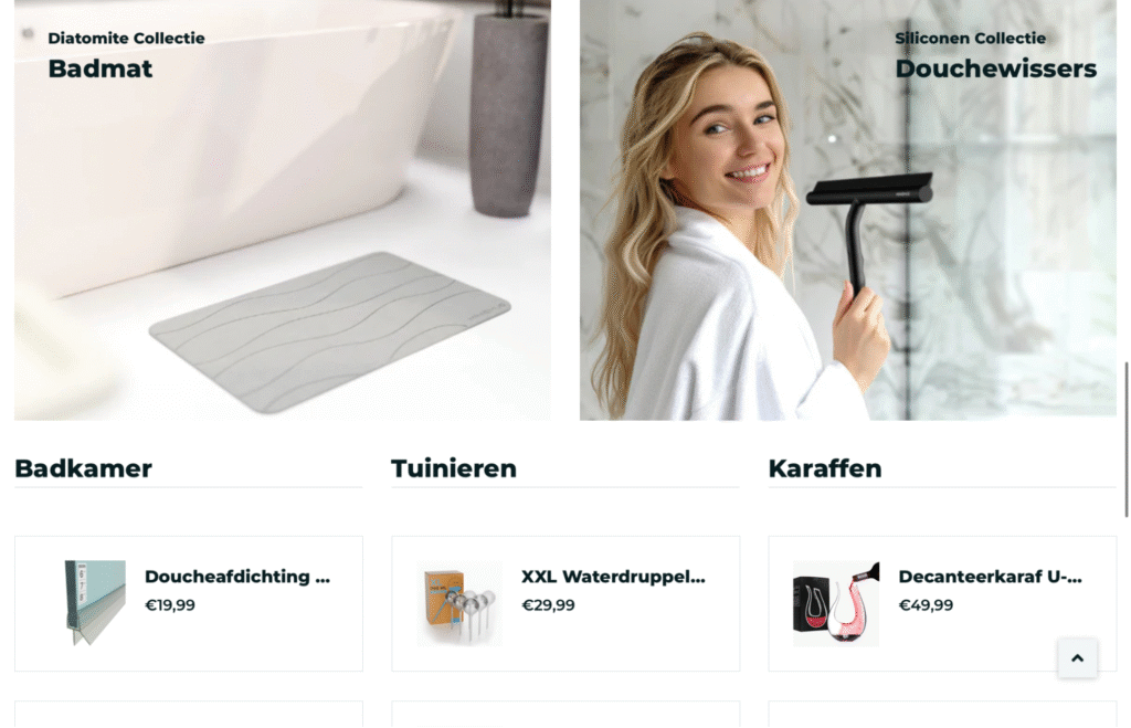
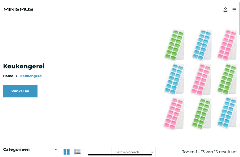
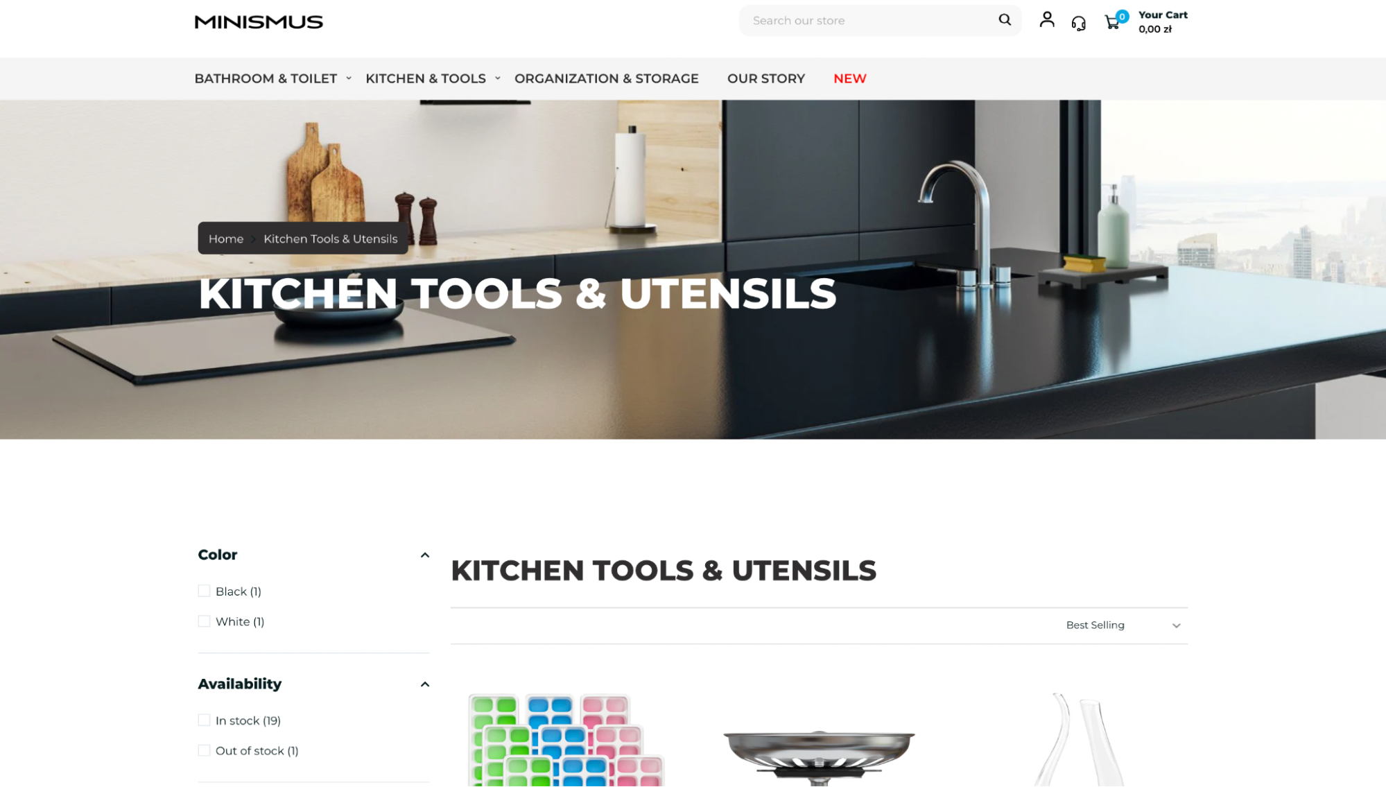
Category Pages: Cleaner, Smarter, Easier to Navigate
Before: Category pages were basic and uninspired — long product lists, limited filtering, and no clear sense of structure. Browsing felt more like searching.
After: Now, every category opens with a clean, modern banner that sets the tone. Filtering options are easier to find and use, and the simplified layout makes products easier to scan. Visuals are clearer, navigation is smoother, and the whole experience feels more intuitive.
The previous version of the site helped us grow — but it wasn’t built to scale. As the Minismus product line expanded, the need for a better digital experience became clear. The new site is faster, easier to use, and better represents the quality and clarity of the brand.
Take a look at the new site – minismus.eu
Got feedback? We’re all ears — and always improving.